
Courtesy: Kohler
Kohler
Turning global brilliance into local relevance
Objective
To transform Kohler's previously limited Shopify experience to cater to realised local Indian needs and evolved behaviour, customised through a dedicated self-hosted platform.
Client
Kohler
Year
2023
Timeline
~2 years
Industry
E-commerce
Scope
WebApp design, Stakeholder management, Responsive
Role
UX Design Consultant
Team Size
1 UX Consultant, 1 BM, 3 PD, 3 PM, 2 BA, 5 Dev, 1 CW, 1 DAM
Outcome
~18.5% increase in year to year sales
Existing Scenario
-
Lack of flexibility in Shopify
-
Digital platform not tailored to local needs
-
In-store sales missing out Customer Data
Lack of flexibility in Shopify
Kohler's Shopify Site did allow access to Back-end codes, Database, and Core Infrastructure. This resulted in complex management of the platform using plugins & integrations.
.png)
Digital Platform not tailored to Local needs
The Experience of the Shopify App was highly influenced by the Tech capabilities. It was not tailored to Local Needs. For example, OTP based Signup flow was absent in contrary to its high demand in the Indian geography.
.png)
In-store sales missing out Customer Data
All point of sales lacked thorough management of data. Shopify Databases were not accessible, and In-store sales had no robust protocol to save sales.

"Kohler India needs a major upgrade in the digital space, kill shopkohler.in and create our own independent platform."
-Managing Director, Kohler India
We are tailoring Kohler for..

B2B
PS Builders Pvt. Ltd.
Working on a Hotel Project that demands 1,200 Smart Water Closets, PS Builders Pvt. Ltd. is actively looking for Premium Products available in the market.

B2C
George
George, an engineer in Google has newly built his residence in the suburb and actively looking for a Premium Bath Tub for his attached Bathroom.
Shopkohler.in Customer Insights
User experience around Shopkohler.in was crude, buried, and lacked better discoverability. It did not communicate the brand image correctly, had multiple usability issues, and not optimised for SEO.
.png)
.png)
Recommendations
Based on brainstorming, UX Reports, endless discussions and Data, the team identified key opportunity areas & recommendations for the new Website.


Implementation Strategy
Identified important customer insights on ShopKohler.in, which is a Shopify site for Indian users but didn’t really capture Kohler’s brand feel or intuitive user flow.

01
Innovation centric Home page for evolving Indian preference.
Indian users are easing faster into Smart Products with evolving preferences due to rising market competition.

Courtesy: Kohler
Smart Products in Hero Banner
First Fold of websites contribute ~80% of engagement, thus rendering this critical section for the most important product or service. For Kohler, advertising the Smart Innovative Products was the most important objective.
.png)
Social Validation
Indian users are highly influenced by social validation, based on UXR Studies. "Best sellers" provides a broad social validation critical to hook users into buying the products.
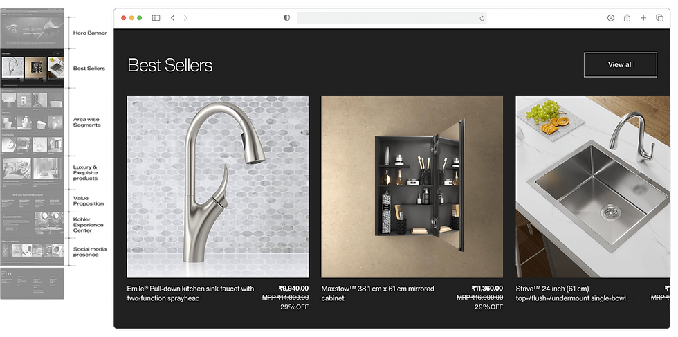
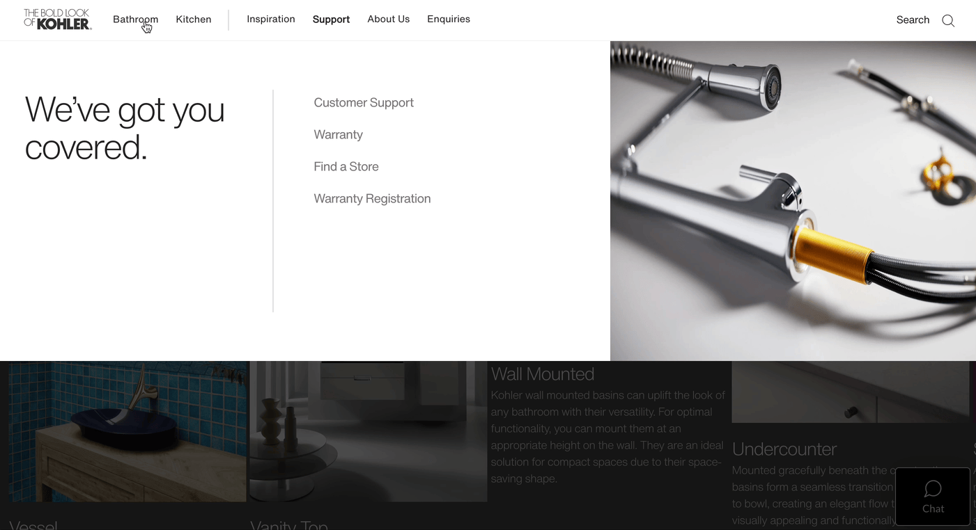
Purpose driven categorisation
Name of the area and purpose is on top of mind when users actively look for a product, based on UXR Report. Users are observed to look for bathroom, kitchen, or toilets as filter criteria to find desired products.

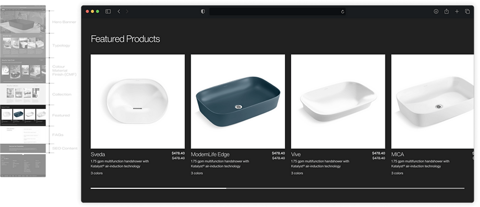
Tease with Luxury Products
Sneak Peek of Luxury Collections to keep users hooked below the fold. Kohler wants itself to project as a luxury brand to Indian Audience to uphold the brand's image.

Communicate Benefits
In order to promote online sales in addition to extensive dealer-led offline sales, value propositions play a critical point of communication, which was a "must have" in the list of inventory as per the Kohler PM Team.

Cross-Sell Experience Centers
Cross-Sell and Advertisement of Kohler Experience Centers through Homepage. Home page as a means to cross-sell physical experience centers due to growing brand recognition in India.

Cross-Sell Instagram Page
Kohler's strong social media presence, and strong inclination of Indian users towards such platforms led to the idea of dedicating a section for social media in homepage with an objective of reinforcing the marketing channels.

Summary and Take aways
Hook the user
Design of homepage should reflect the most viable premise that aligns with vision of the company. In this case, it was Smart products.
Premise
A business can have multiple value offerings, but at given time, on a given context, it might strategise its premise for the audience. Kohler has set the premise of Smart Innovative Products.
MECE
Homepage sections should be mutually exclusive & collectively exhaustive without repetition or overlap while assuring it covered everything.
Cross-selling
Homepage designs should take the opportunity to cross-sell other products, services, channels for a reinforced customer base.
02
A Common Exploded Footer to address dead-ends with product discoverability
Better UX demands continuation of user flow, thus leaving no dead-ends. Kohler devised an additional section at the end of each page for users to keep up the flow.
Rationale
Unlike infinite-scroll platforms, Kohler’s limited product catalog often leads users to reach the end of a page quickly, creating a dead end. Dead ends are never a good experience whether it is in real life or while navigating through a digital product. The expanded footer solves this by keeping users engaged and guiding them to explore more products seamlessly, like turning a problem into an opportunity.
.png)
.png)
03
Phone number based OTP in Account Creation & Login to cater to Indian Behaviour.
Most Indian users prefer sharing phone number for OTPs while Signup or Login.
Rationale
The idea of using mobile number based OTP is a result of retaining existing Indian behaviour evolved due to rising Startup culture and growing competition among digital applications, where people have become more comfortable with.

Inspiration
Widely used Indian e-commerce examples are shown below that uses phone number based OTP for Account Creation and Login. This behaviour of using OTPs has developed a habit of abandoning both passwords and password managers to a great extent.

Use cases
As part of scope, Sign In and Create Account Flow for both Desktop & Mobile version were designed & delivered for developer handoff. Multiple use cases like creating account on the go during checkout, login status indicator in the header, and many more were covered.

Responsive Screens for Create Account

Sign In for Desktop

Sign In during Checkout

Summary and Take aways
Signup is a business need
Intent to signup is all time low for users, as they do not perceive it to be any useful. Hence, signup flow should have least number of effortless steps.
Account related Perks
Account registration helps the user to purchase products both in-store and online, while retaining perks, and access multiple other benefits. Communicating these benefits is important.
Signup should NOT be pushed hard
As a widely practiced norm in the interest of better user experience, users should be allowed to browse through the WebApp without mandating signup, except purchase.
04
Category Landing Page as an Immersive Product Narration
Indian audience needs better awareness, effective communication, and improved feature education about Kohler's premium and innovative products. Category Landing Page does the heavy lifting here.
Rationale
Innovative products & other Premium products of Kohler gaining traction in the Indian market needs broad awareness, effective expectation management, and improved feature education. Category Landing Page bridges the gap between Homepage and Product Listing Page does the heavy lifting by easing the user through all the three considerations. In a nutshell, CLP sets a narrative to present the products in the most effective way.
Starts with Hero Banner
Hero banner sets an immersive experience for users to further explore the page to enjoy the product presentation.

Type of space drives decision
Users first create a space, then buy Kohler products, a common point as per UXR report. Thus, users look for various types of the same product to suit the space they have in their mind.

Colour, Material & Finish
Colour Material Finish is a primary need for many Interior Designers, as per UXR Report. Based on research, it is found that CMF drives many bulk purchases carried out for large orders by design industries.

Appeal to the Emotional want
Users prefer different styles of the product to express their taste. Most users are found to have displayed a strong sense of design taste towards different styles of a certain product, hence the need to have a section that houses this aspect.

Social Validation
Indian users are inclined towards socially validated products, as per UXR Report. Introducing Featured Products builds confidence within Indian users driving a high probability of purchase.
CLP SEO content blocks
SEO through FAQs and SEO Content Block, a section worth incorporating for SEO of each Category Landing Page.

Typical Dev Handoff
Typical Authoring of CLP Template Design for Developer Handoff. For efficient Developer Handoff, Kohler Team devised this Figma template for relaying both Visual and Textual content for smooth coordination.
%20(1).png)
30+ CLP Designs
Kohler has Multiple Category Landing Pages (CLP) for different products, all designed within the scalable template devised by the team. A template that houses 30+ CLP Designs.
.png)
05
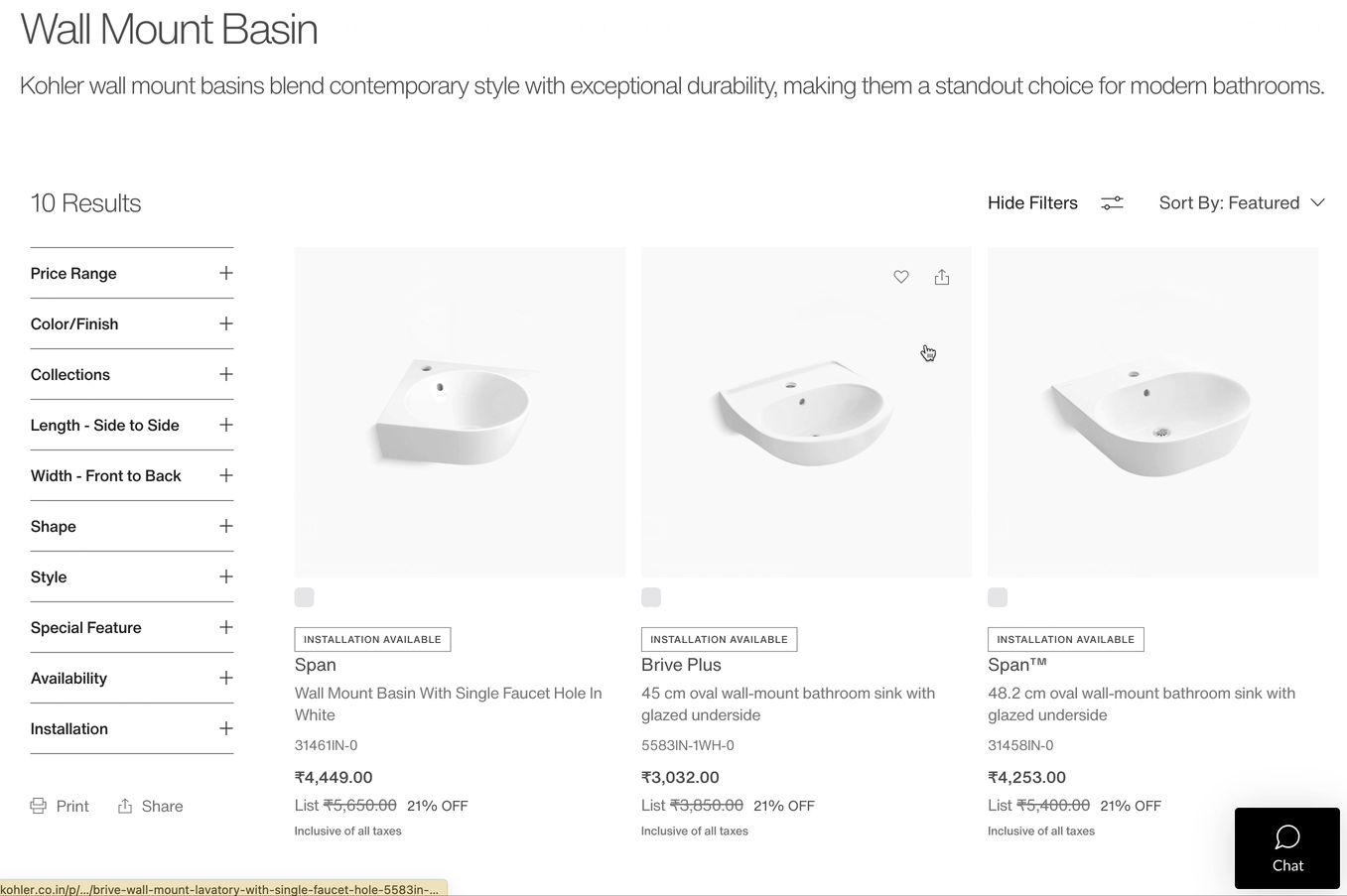
Redesign Product Listing Page to improve findability and product discovery.
Search, Filter, Sort are fundamental UIUX hygiene. Product Listing Page, a list of products based on filter criteria contributes to higher chances of product discovery & findability, thus improving conversion.

Elements of PLP
Product Listing Page showcases multiple products & description in the most engaging way by optimising the displayed content through in-depth UXR studies. This page includes a clear entry title, easy navigation, filtration, and sort functionalities as shown below.
.png)
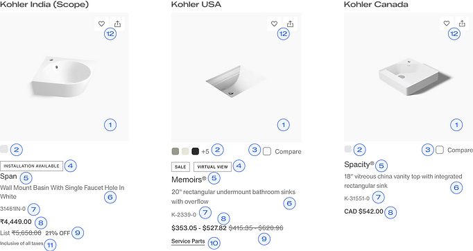
Customised for Indian Audience
Products in Product Listing Page showcases multiple products in one go. The challenge here is to show more information without overwhelming the user. Following are the specs shown in the PLP in comparison with Kohler USA and CA.
.png)
.png)
Summary and Take aways
Sweet Spot
Product Listing Pages need to balance plethora of content with simplicity for ease of consumption.
Filter Criteria Order
Filter Criteria identified through User Research and Business needs to have the right order, sometimes achieved through rigourous A/B testing.
Specs
Surfacing Specifications with Product images is highly influenced by regional/country specific user needs & behaviours.
06
Redesign Product Detail Page with custom perks for Indian needs
Indian users prefer to learn about installation services availability, discounts, reviews, refund and returns, and other linked services and perks right upfront with product specifications, based on UXR Report conducted by Kohler Product Management Team.
Introduction
Product Detail Page is a specification centric page for a particular product that houses all perks and associated services to match with other widely used e-commerce WebApps in India, thereby reinforcing users purchase decision.
Primary Elements
Product Detail Page is dedicated to a specific Product to lay down all specifications, features as well as perks and linked services, for the user to make an informed purchase decision.
.png)
The First Fold
Deciding the content to be shown in the first fold of the Product Detail Page is based on UXR Report, Voice of Customers, Patterns in E-commerce platforms in India, and other best practices.
.png)
The Second Fold
Below fold of Product Detail Page includes more details and additional information reinforcing Purchase Decision. The Below Fold includes PDFs of installation guides, links to pages that provides more information to the user.
.png)
The Last Fold
The Last fold details out the services available for the product and also provides drawings & 3D views of the product for Architects & Interior Designers.
.png)
Installation Guide
Kohler offers PDFs of multiple guides and specifications for users to download. Based on UXR Report, most customers are dealers and construction businesses involved in bulk purchases for large scale projects, thus creating the need to provide downloadable and shareable PDFs within the team at site to validate if the product fits the space.
.png)
120+ Product Detailed Pages
Number of PDP Pages indicate the number of active products listed on Kohler India WebApp. The PDP pages are designed and delivered in the template shown above in collaboration with Digital Asset Management & Content Writer Team.
.png)
07
Optimising Cart & Checkout Page to reduce churn.
~78% drop outs result from Cart. The Cart & Checkout pages for any e-commerce product are the most critical point for user's purchase decision.
%20(1).png)
Elements of a Cart
The Cart majorly includes items selected for purchase, Order summary, Perks & Services associated to the Products chosen, and upsell of recommended products. While best practices are implemented to design the Cart, efforts are made to bring in tailored value to the Indian users.
.png)
Checkout Flow
The Checkout flow including the Cart and Payment Page is customised for Indian needs, which includes product summary, local currency, regional perks and services, Promo codes tailored to local expectations, and inclusion of local Payment methods like UPI.
.png)
Cart & Promo Code
The Cart is designed for the user to manage items, access basic product information, quantity, price, perks and services, and apply Promo Codes before payment.

Add Address
Before payment page, user is required to enter an address or select from previously added ones. User can edit the address before confirming it, as this estimates the delivery charges.

Scan & Pay (UPI)
Kohler introduced bulk purchase of products to encourage online purchase by businesses, which needed additional step of adding PAN number (Permanent Account Number) of the customer to

PAN for bulk purchase
Under Section 206AA / Rule 114B of the Income Tax Act in India, all sellers must collect PAN details for high-value transactions worht more than 2,00,000 INR.


Concept: Save Cart
The idea of using mobile number based OTP is a result of retaining existing Indian behaviour evolved due to rising Startup culture and growing competition among digital applications, where people have become more comfortable with.
.png)
Summary and Take aways
Crisp & Clear Communication
Checkout Page needs to be highly optimised for crisp & clear communication of product, perks, services, prices, & product specific information.
Room for improvisation
Checkout page needs to be designed in a way that it can be scaled to include any new item in the flow based on context, time, and legalities.